
Case Study: Bakery Shop Logo Design
In today’s food and beverage (F&B) market, branding extends beyond taste — it’s about trust, identity, and vision. GT Cake House needed a bakery shop logo design that reflected its quality and long-term goals. This case study examines how we assisted in transforming a local bakery into a recognisable brand.
The Concept Behind GT Cake House
GT Cake House started as a family-style bakery shop with 6 branches in Klang. They are dedicated to delivering delightful baked goods to satisfy every taste – all made with love. As they planned to expand, GT Cake House needed a professional brand identity. That’s when Kangxiang Graphic Design team stepped in to deliver a distinctive bakery shop logo design that speaks more than just butter and flour.
![]()
Defining Bakery Shop Logo
A bakery shop logo isn’t only about baking icons like cakes, breads or pastries. It’s about creating an emotional connection – something that looks warm trustworthy, and evokes feelings of happiness and contentment. A strong bakery shop logo should be:
- Memorable
- Scalable
- Adaptable across digital and print
- Unique in colour and shape
- Legally protected
GT Cake House Logo Design Creative Brief
We began by understanding GT Cake House’s core values, and they specialise in baking high-quality cakes, buns, breads, and pastries, with a strong focus on food safety and nutrition. The brief was clear:
- Avoid using common or direct bakery icons.
- Emphasise the brand’s focus on quality and health rather than just aesthetics or trends.
- Reflect the bakery’s reputation for safe and nutritious products.
- Ensure it looks clean, professional, and suitable for trademark registration.
Importance of A Professional Logo for Bakery Shop Business
In Malaysia’s bakery market, branding is just as important as flavour. With over 2,000 active bakeries nationwide (source: FMM, 2023), customers often choose a brand they recognise. A professional bakery shop logo design can:
- Increase trust by 75%, according to Adobe
- Help attract more online orders
- Support social media marketing
- Build consistency across packaging, signage, and delivery boxes
![]()
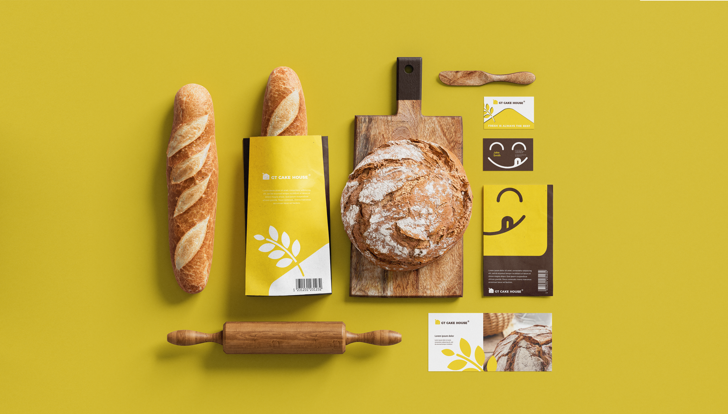
Developing the Brand Identity: GT Cake House Logo Design
Let’s go behind the scenes.
-
- Icon: A simple yellow house with a smiling face creates a warm, welcoming vibe—like your neighbourhood bakery. A wheat stalk subtly hints at baking, while the unique smile adds a playful, memorable touch.
- Colour Theme: Yellow evokes happiness and appetite; brown represents trust and natural quality—perfect for their wholesome, additive-free products. Together, they create a brand that feels both delicious and reliable.
- Font: The rounded Messenger font adds a handcrafted, friendly feel. Its boldness ensures the brand stands out across signage and packaging while still maintaining a clean and professional appearance.
The Real Challenge: Designing Bakery Shop Logo Without Being Obvious
One of the biggest challenges was avoiding a too-obvious design. Many bakery shop logos fall into the trap of overused icons like:
- Cakes or breads
- Spoons or whisks
- Chef hats
The client requested something that didn’t scream “bakery” but still made sense once applied to packaging, uniforms, and online branding. The solution came from a clever creative twist: integrating a yellow house with a small wheat stalk on top and a smiling face as the icon. This approach not only gave the logo a playful and memorable look but also provided a meaningful visual identity that did not rely on traditional bakery symbols.
![]()
Before and After: GT Cake House Logo Transformation
Before: The old logo featured a line-style house icon paired with handwriting fonts within a stamp. It felt outdated and lacked a strong brand presence.
After: The new logo, designed by the Kangxiang Graphic Design team, is modern, clean, friendly, and memorable. It’s visually appealing across all platforms — from packaging to social media — and better reflects the brand’s quality and growth.
GT Cake House: Now a Registered Trademark
After finalising the bakery shop logo design, we assisted GT Cake House in registering their logo as a trademark in Malaysia. Why is this important?
- It gives legal ownership and protection.
- It prevents copycats or brand misuse.
- It increases business value in future expansion or franchising.
Today, GT Cake House proudly displays the ® mark on all packaging and social media.
The GT Cake House logo was crafted to stand out — and it now leaves a strong, lasting impression as a successful bakery brand identity.
- Simple yet instantly recognisable
- Modern, yet warm and welcoming
- Versatile across packaging, signage, and digital platforms
- Unique, yet connected to the brand story
We didn’t just create a bakery shop logo design. We helped a homegrown Malaysian business look and feel like a national brand.

At Kangxiang, we believe every business deserves a logo that makes an impression. Whether you’re starting a bakery, café, or e-commerce store, we can help you design a professional logo that suits your needs. Ready to grow your brand? Contact us for a free logo consultation today.


No Comments
Sorry, the comment form is closed at this time.