Case Study: Furniture Company Logo Design
Creating a logo for a furniture company requires a blend of creativity, an understanding of the brand’s essence, and market insight. In this case study, we will explore the step-by-step process of designing a logo we created for YHL Cabinet. The journey from concept to final design highlights the importance of each phase in creating a furniture logo that resonates with the target audience and enhances the brand’s identity.
Understanding the Brand
Before the logo design process began, it was crucial to understand the furniture company’s brand. This included:
- Company Overview:
- Name: YHL Cabinet
- Industry: Furniture, spatial planning
- About Company: A cabinet expert specializing in designing, supplying, building, and installing all sorts of cabinets for kitchens, bathrooms, living rooms, bedrooms, offices and more with guaranteed quality
- Target Audience: Homeowners aged 24-40, primarily in urban areas, who value aesthetics and functionality.
- Brand Values:
- Quality: Commitment to using durable and premium materials.
- Comfort: Ensuring all products enhance the comfort of living spaces.
- Style: Offering contemporary and innovative designs.
- Sustainability: Emphasizing eco-friendly manufacturing practices.
Furniture Industry Market Research
With a clear understanding of the brand, the next step involved extensive research.
- Company Analysis:
- Key Competitors: IKEA, Ashley Furniture, Wayfair
- Competitor Logos: Analyzed logos of key competitors to understand industry trends and differentiation opportunities.
(a) IKEA: Bold, simplistic design with a focus on readability.
(b) Ashley Furniture: Traditional and elegant, emphasizing reliability.
(c) Wayfair: Modern and playful, appealing to a younger audience.
- Audience Insights:
- Preferences: Customers prefer modern logos that are easily recognizable and reflect product quality.
- Colour Psychology: Warm and earthy tones are associated with comfort and quality in the furniture industry.
- Typography Trends: Clean, sans-serif fonts are popular for their readability and modern appeal.
Logo Design Concept Development
Brainstorming Ideas:
- Themes: Comfort, home, modernity, sustainability.
- Elements: lines, spaces, perspective.
- Initial Sketches: Created multiple rough sketches incorporating different symbols and themes.
Logo Design and Refinement
- Digital Rendering:
- Colour Palettes: Explored various colour combinations, focusing on warm earth tones.
- Typography: Tested different font styles to find the perfect match for the brand’s voice.
- Iterations:
- Client Collaboration: Discussions with the client to review progress and incorporate feedback.
- Adjustments: Made adjustments to icon, colours, and typography based on client input.
- Finalization: After several rounds of revisions, finalized the logo design that best represented YHL Cabinet’s brand values and appealed to the target audience.
Final Logo Design
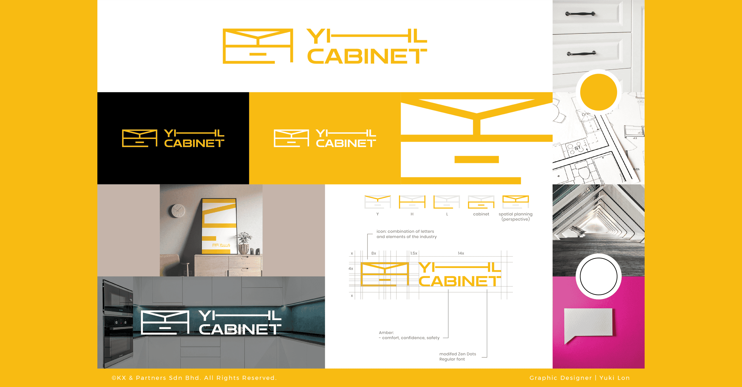
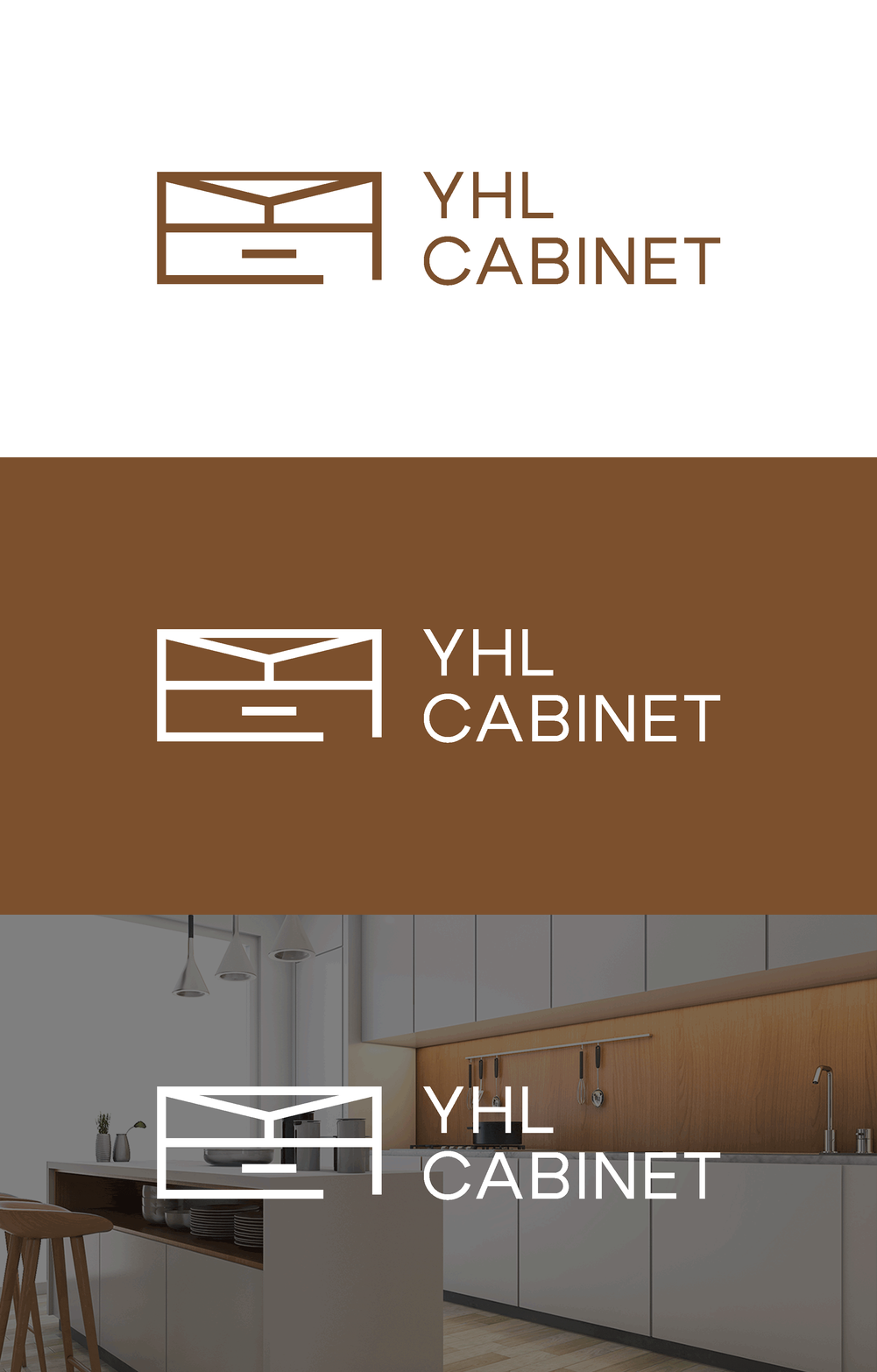
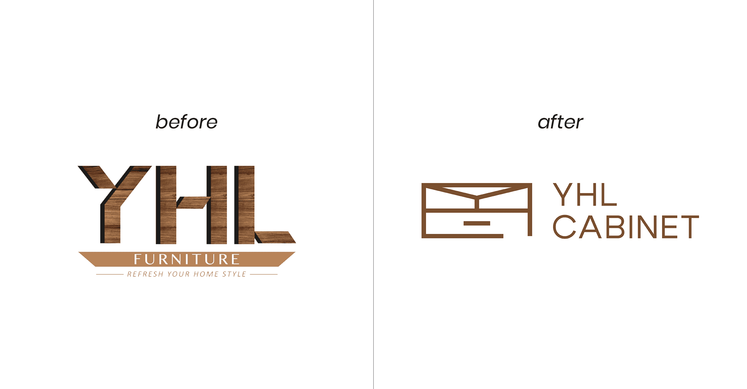
The finalized logo is a combination of the letters Y, H, and L with cabinet and spatial planning elements. The entire logo symbolizes YHL Cabinet’s expertise in designing and installing cabinets for various spaces.
Description:
- Icon: A modern, stylized cabinet in line-form that conveys quality and modernity.
- Colour: Russet, a brown with a yellowish or reddish tinge, symbolizing coziness and sustainability.
- Typography: Clean, sans-serif font for readability and modern appeal.
Before & After: YHL Cabinet Logo Redesign
The transformation of the YHL Cabinet logo from its original design to the updated version showcases a significant shift in branding strategy.
Before:
The original logo featured bold, 3D block letters with a wood texture, emphasizing a rustic and traditional aesthetic. The tagline “Refresh Your Home Style” underlined the company’s focus on home improvement.
After:
In contrast, the redesigned logo adopts a minimalist and modern approach. It uses a clean, linear icon resembling a cabinet paired with a sleek, sans-serif font. The new design simplifies the visual elements, enhancing readability and giving the brand a contemporary, sophisticated look that better reflects its evolution and market positioning.
Apparently, this redesign not only modernizes YHL Cabinet’s image but also aligns it with current design trends, ensuring it appeals to a broader, design-conscious audience.
Impact and Results
The new logo design for YHL Cabinet significantly impacted the company’s market presence and business performance. By capturing the brand’s essence and appealing to the target audience, the logo enhanced brand recognition, increased sales, and customer loyalty.
- Brand Alignment: The logoaligns with YHL Cabinet’s values, conveying a sense of warmth and quality.
- Market Differentiation: Unique design elements differentiate YHL Cabinet from its competitors while fitting industry trends.
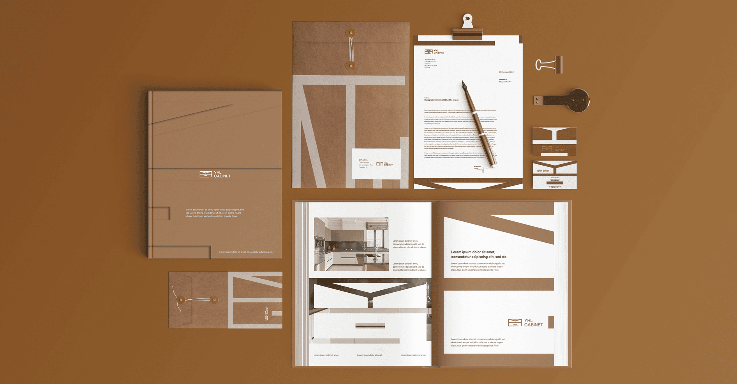
- Versatility: The logois versatile and works well across various mediums, including digital, print, and packaging.
Redesigning a brand new logo for YHL Cabinet involved a thorough understanding of the brand, detailed market research, and iterative design processes. The final logo successfully stands out in the competitive furniture market. This case study illustrates the importance of a methodical approach to logo design, ensuring the final product looks great and serves the brand’s strategic goals.
As an ISO-9001 certified website design agency that holds a Google Partner certificate, Kangxiang adheres to the highest standards of quality and professionalism. Our team of expert designers are dedicated to helping businesses like yours stand out in a competitive market. Contact us today to transform your brand with a compelling logo. Your brand’s journey to excellence starts here!




No Comments
Sorry, the comment form is closed at this time.