
Case Study: Financial Education Logo Design
Trust and clarity are essential in the financial education industry. Before joining a course or community, investors often notice the brand logo first. A strong logo builds confidence, signals expertise, and represents long-term growth. In this case study, Kangxiang team shares the strategy and results behind the financial education logo design for Better Investing Academy (BIA), showing how visual identity supports investor trust, community growth, and brand scalability.
Introduction to Financial Education Logo Design
1. About Financial Education Brand:
BIA operates in financial education, investment training, and stock consultancy. It helps busy investors make smarter stock decisions without spending hours on research. Over the past 3 years, BIA has helped investors recover and grow their portfolios using a growth-focused yet defensive investment approach. As a result, the brand needed a logo that reflects growth, trust, and education, not hype.
2. Logo Design Creative Brief and Client Requirements:
The logo design brief focused on:
- Professional and credible appearance
- Luxury feel with strong legitimacy
- Clear differentiation from investment scams
- Wealth and growth symbolism
- Appeal to beginner and intermediate investors
- Clear message of education and long-term growth
- Flexible use across digital and print platforms
3. Target Audience:
BIA’s target audience includes:
- Working professionals aged 25–45
- Busy investors with limited research time
- Learners seeking guided stock strategies
- Community-driven investors who value coaching
BIA Logo Design Key Elements
To meet these goals, we developed a logo based on monogram symbolism and financial metaphors.
- Monogram Inspiration: The logo is built around the letter “b”, combining:
- Leaf: represent growth and long-term wealth
- Stock candlestick: reflect market performance
- Chat bubble: symbolise education, coaching, and community
- Colour Selection: Cal Poly Green and Forest Green were chosen to represent:
- Growth and prosperity
- Stability and trust
- Positive investment outcomes
- Typography: The logo uses Mustica Pro Semi Bold font for its:
- High readability at all sizes
- Modern yet professional feel
- Consistent use across digital and print platforms
![]()
BIA Logo: Then vs Now
Before the redesign, BIA’s visual identity lacked consistency and strong symbolism. The earlier logo did not clearly communicate financial education or coaching. After the redesign:
- The logo became more recognisable
- The meaning behind the design became clearer
- The brand appeared more structured and trustworthy
Logo Application Across Platforms
A strong financial education logo design must work everywhere. Therefore, we tested the logo across multiple real-world applications.
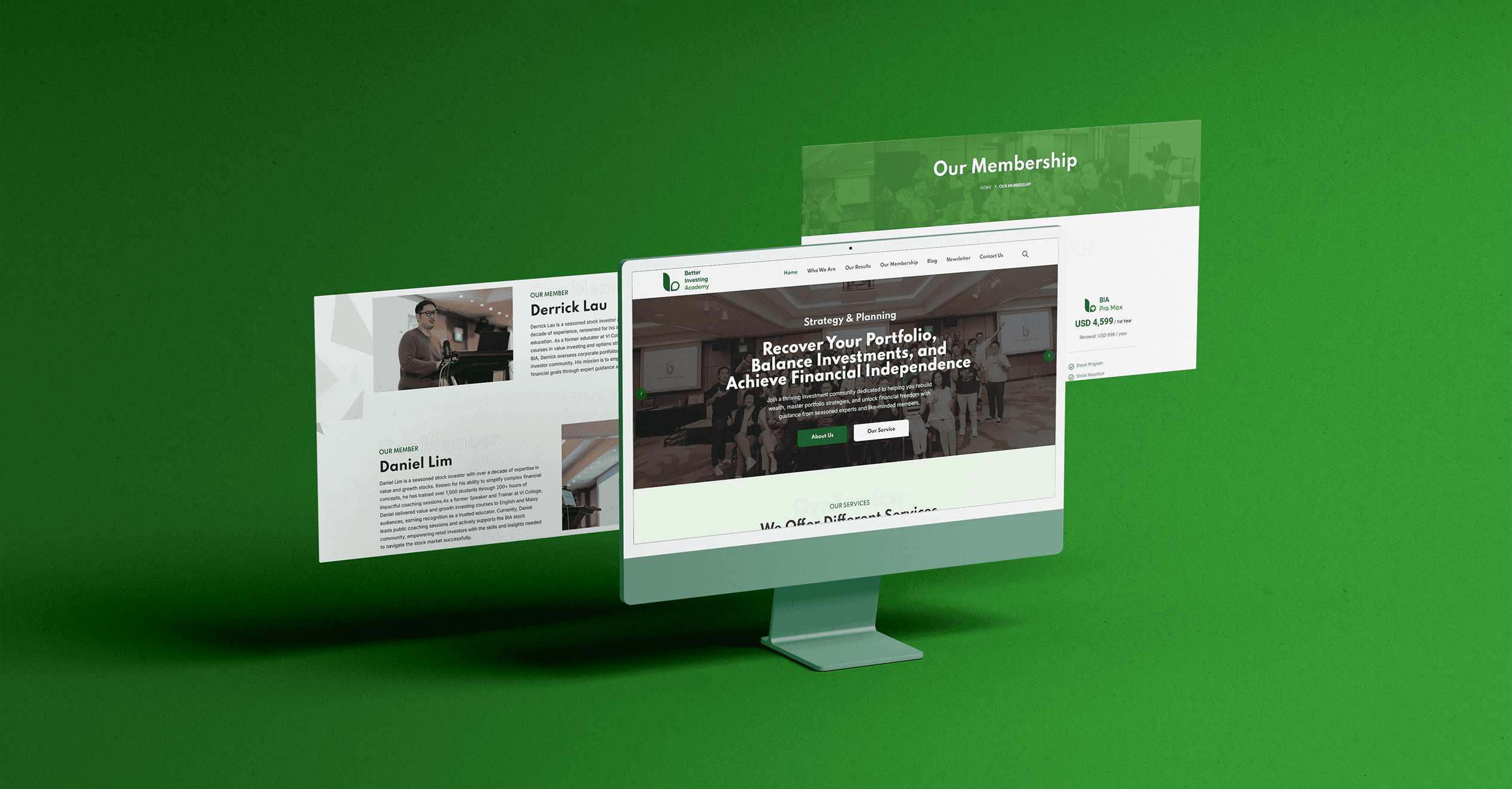
1. Website Platforms: On BIA’s website and learning portals, the logo:
- Maintains clarity on desktop and mobile
- Reinforces trust during course sign-ups
- Supports a clean user experience
2. Community Merchandise: BIA awards badge cards to students and investors who achieve milestones, such as investment returns or course completion. These badge cards:
- Strengthen community motivation
- Act as physical brand touchpoints
- Reinforce achievement and progress
![]()
3. Printed Event Materials: For offline events, the logo is applied to roll-up buntings and promotional displays. Here, the green colour tones ensures high contrast, while the monogram design remains visible from a distance. This helps attract attention during seminars and workshops.

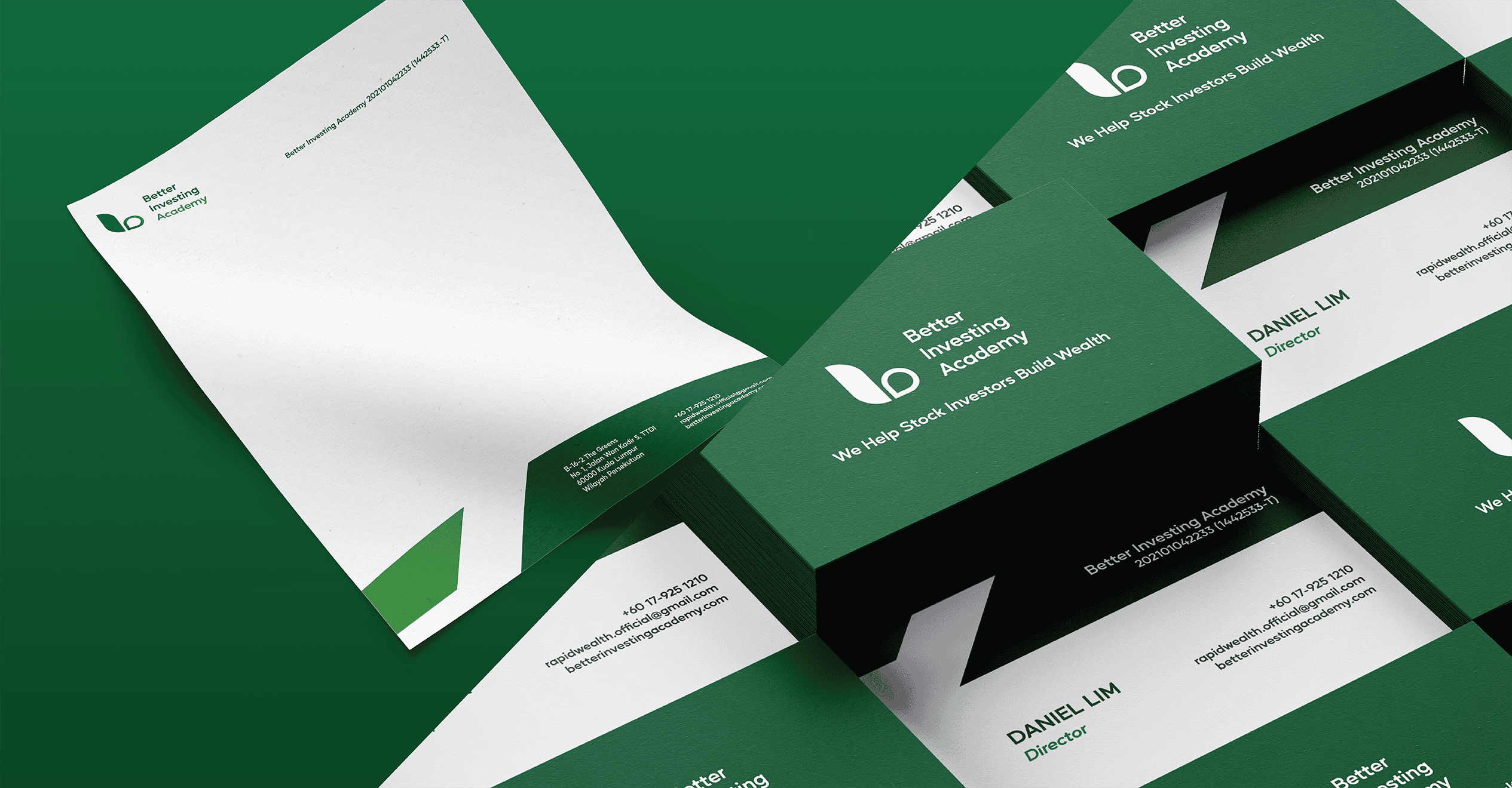
4. Stationery and Brand Guide: The logo is also used on:
- Business cards
- Letterheads
- Official brand guidelines
Having a clear brand guide ensures consistent usage across partners, instructors, and marketing materials.
![]()
Results and Brand Impact
After the logo launch, BIA experienced several positive outcomes:
- Stronger brand recognition across digital platforms
- More consistent visual communication
- Increased professionalism during investor onboarding
- Better alignment between brand image and teaching philosophy

Frequently Asked Questions (FAQs)
1. Why is logo design important for financial education brands?
A: A professional logo builds trust, credibility, and confidence among investors and learners.
2. What elements should a financial education logo include?
A: It should reflect growth, stability, and knowledge, using clear symbols, colours, and readable fonts.
3. Why use a monogram logo for an investment brand?
A: Monogram logos are simple, memorable, and easy to apply across digital and printed materials.
4. Why is green commonly used in financial education logo design?
A: Green symbolises growth, wealth, and stability, making it suitable for finance-related brands.
5. Can one logo work across all platforms?
A: Yes. A well-designed logo is flexible and stays clear on websites, merchandise, events, and stationery.
This financial education logo design case study shows how thoughtful design supports brand credibility and long-term growth. By combining symbolic design, meaningful colour choices, and clear typography, we helped BIA create a logo that conveys investing, coaching, and community in a single visual mark. Good logo design is not about decoration. Instead, it is about communication, consistency, and confidence.

If you are building a financial education brand, investment academy, or consultancy, your logo should work as hard as you do. At Kangxiang, we design logos that are strategic, scalable, and built for real business growth. As Malaysia’s first ISO9001-certified Google Partner website design agency, we help brands turn ideas into identities that perform. Talk to us today and let us design a logo that builds trust, clarity, and long-term value for your business.


No Comments
Sorry, the comment form is closed at this time.