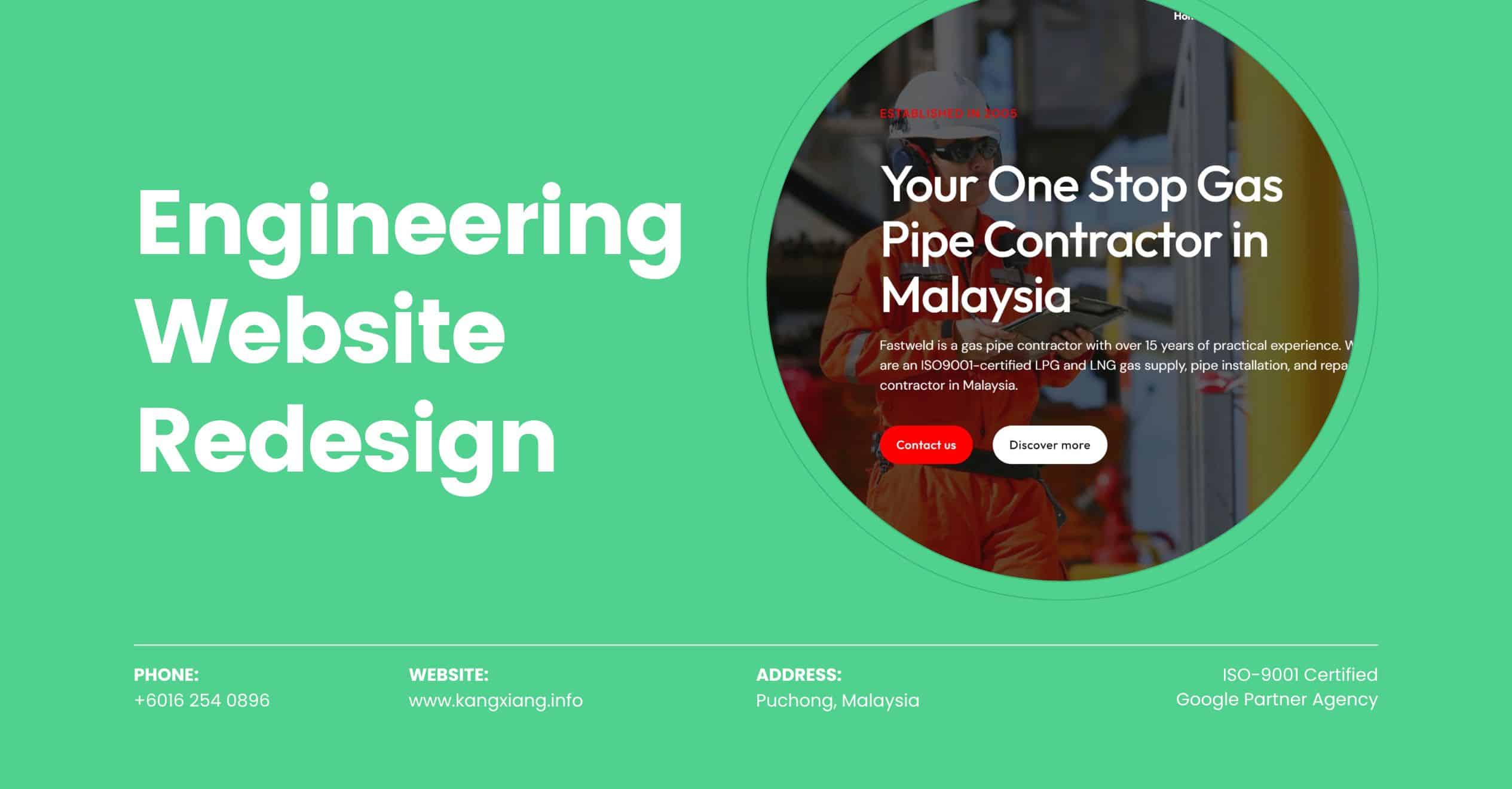
Case Study: Engineering Website Redesign
Fastweld is a well-known gas pipe contractor in Malaysia, specializing in various aspects of pipeline construction, installation, and maintenance. Given the critical nature of gas pipelines in energy distribution, they typically focus on ensuring high standards of safety and quality. Fastweld has built a reputation for reliability and professionalism in the Malaysian market, often collaborating with various industries, including oil and gas, petrochemicals, and utilities. This article shows how we assist Fastweld in transforming its outdated engineering website into a modern, user-friendly platform, enhancing brand identity and customer engagement.
Client: Fastweld Gastech Engineering Sdn. Bhd.
Industry: Engineering
Service Focus: Website revamping
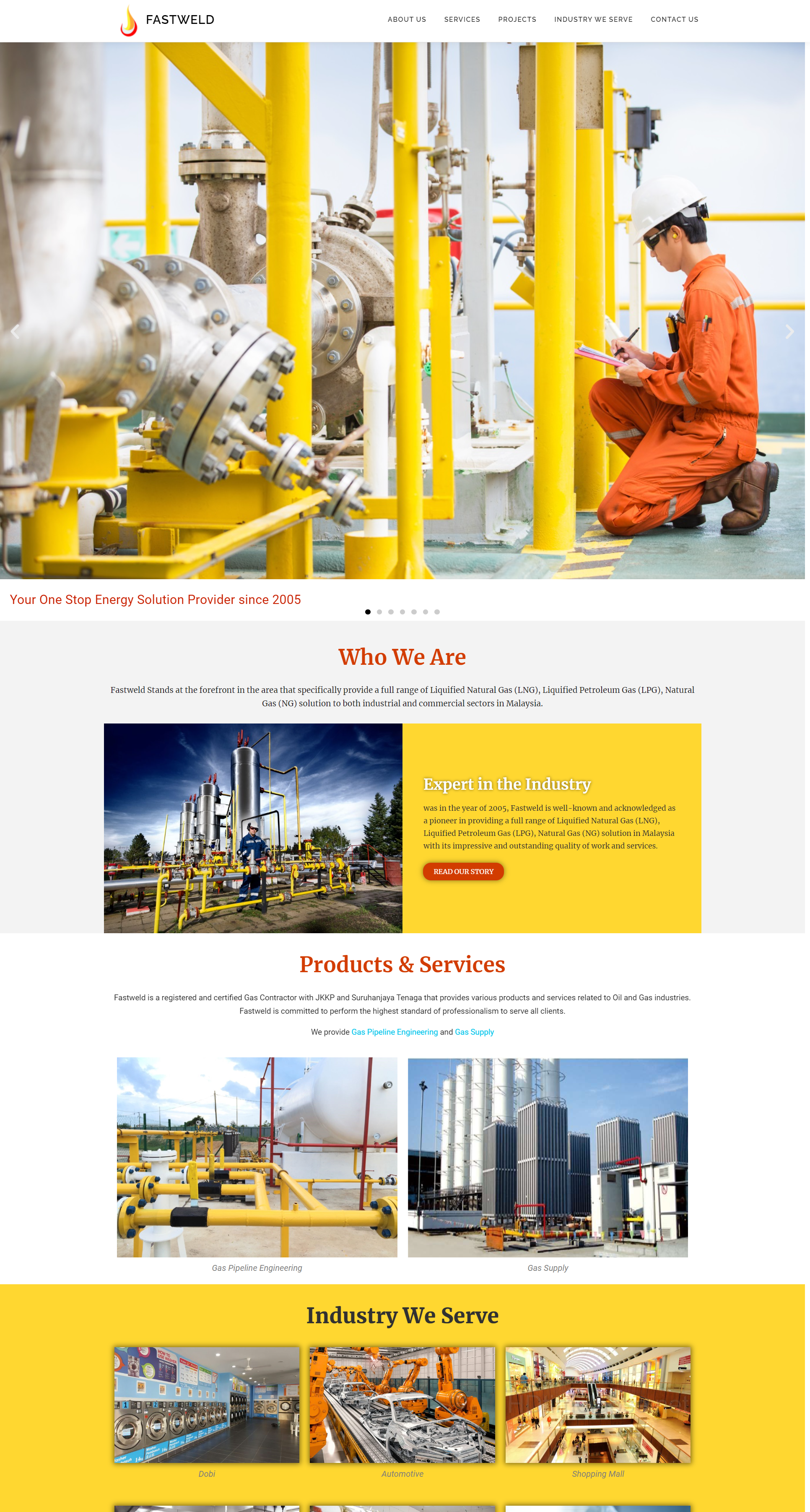
Before Website Redesign
Before the redesign, Fastweld faced challenges with its outdated website, which struggled to showcase its innovative solutions and effectively get good results from Google advertising. Recognizing the need for a fresh online presence, they approached us with a vision: to create a modern, fast-loading, user-friendly engineering website that reflects their commitment to quality and service. Together, we set out to transform their digital identity and enhance customer engagement.
- Small Text Size: If the text is too small, it can be difficult for users to read, especially on mobile devices or for those with visual impairments. This can discourage visitors from engaging with content, ultimately impacting retention and conversion rates.
- Complicated Layout: A cluttered or complex design can overwhelm visitors. If there are too many elements competing for attention, users may struggle to find what they need, leading to frustration and potential abandonment of the site.
- Lack of Creativity: A design that lacks originality can feel bland and uninspiring. If a website uses generic templates or fails to convey a unique brand identity, it may struggle to capture user interest and stand out in a crowded market.
- Colour Scheme: Using an excessive number of colors can create a chaotic visual experience. This can distract users and make it difficult for them to focus on important content. A simpler, more harmonious color scheme is often more effective.
- Ignoring SEO: A lack of attention to search engine optimization can limit a site’s visibility. Proper use of headings, meta tags, and alt text is essential for attracting organic traffic.
The Results
- Improved SEO Performance: A well-designed website adheres to best practices for structure and navigation, making it easier for search engines to crawl and index your pages. This helps improve rankings in search results.
- Enhanced User Experience: A user-friendly design simplifies navigation, making it easy for customers to find the information or products they seek. This leads to longer visit durations and reduces bounce rates.
- Quality Content: Good web design organizes content in a way that is easy to read and digest. This includes using appropriate fonts, sizes, and formatting, which helps keep users engaged and encourages them to consume more content.
- Visual Consistency: A cohesive design utilizes consistent colors, fonts, and imagery that align with your brand identity. This visual consistency makes your brand instantly recognizable across different platforms.
- Improved Readability: Using appropriately sized fonts ensures that content is easy to read across devices, reducing strain and making information more accessible.
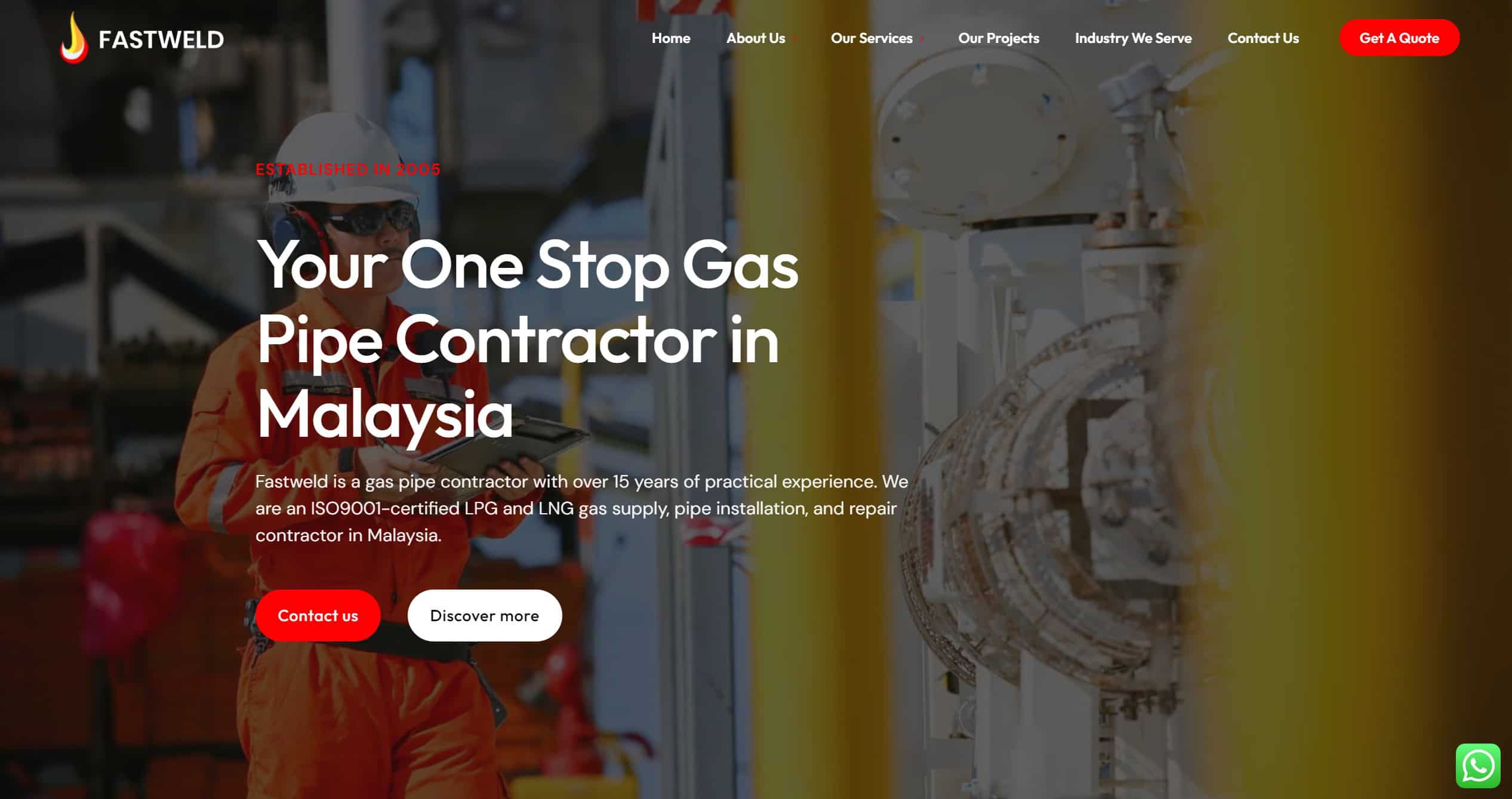
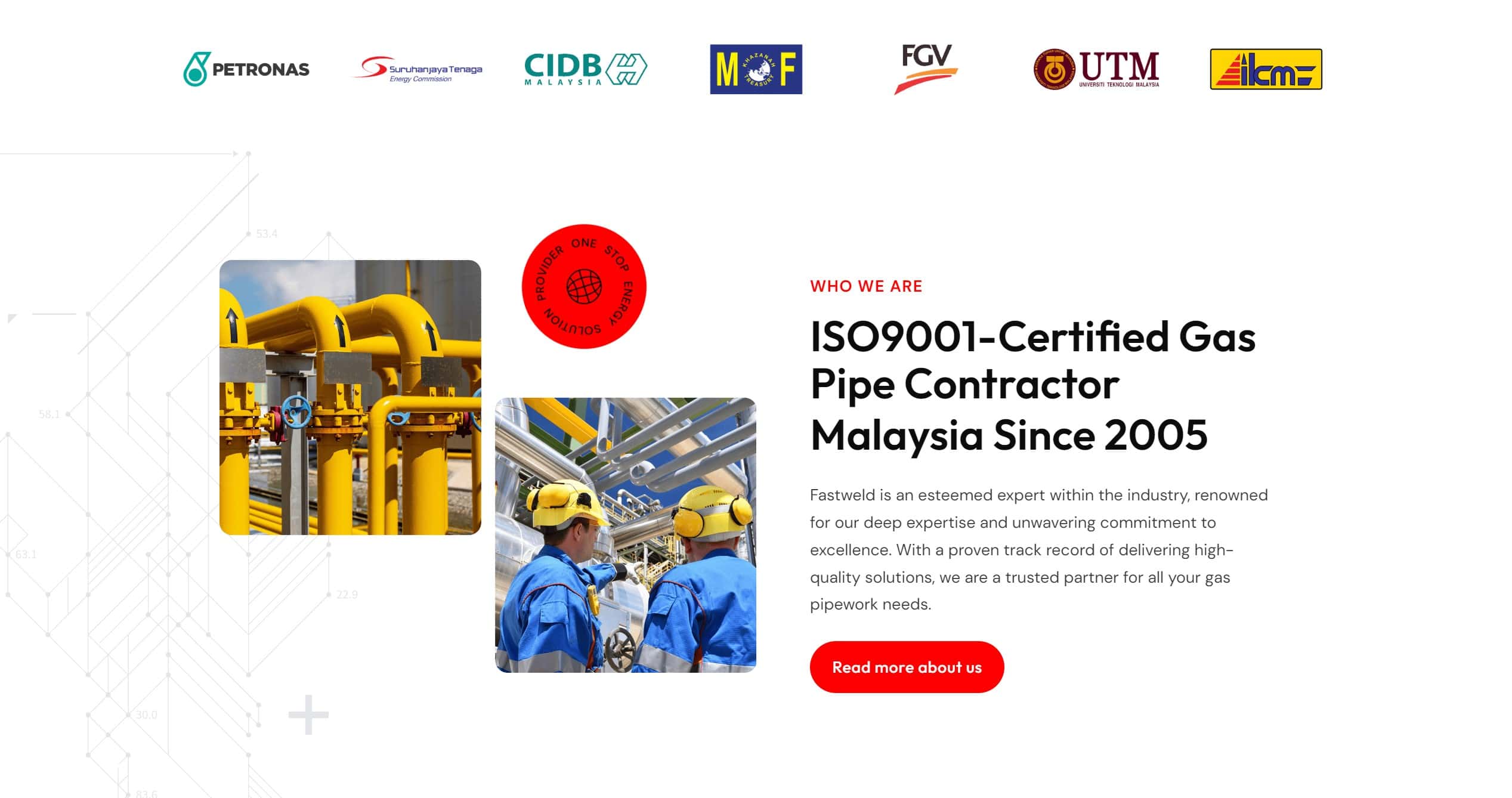
Engineering Website Home Page
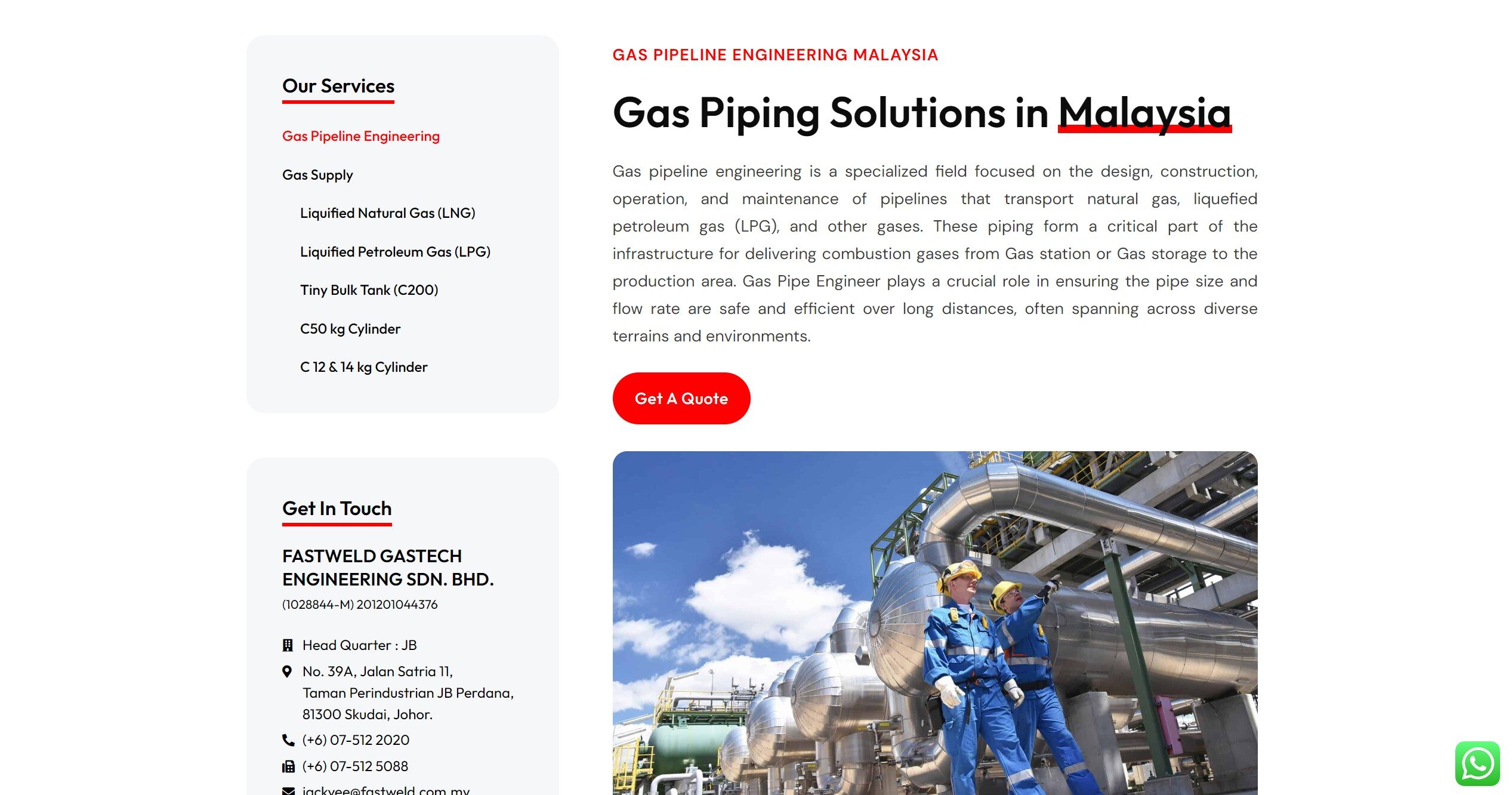
Service Page
We are an ISO-9001 certified website design agency and Google Partner badged. This is our Google Partner certificate. If you want to build a WordPress website and get the RM1,500 Google ad credit rebate, contact us now.



No Comments
Sorry, the comment form is closed at this time.