Case Study: Vertical Mobility (Home Lifts) Company Logo Design
As an ISO-9001-certified design agency and Google Partner, we specialize in compelling branding solutions. Our collaboration with Amco Elevation, a leader in vertical mobility, showcases our expertise. This case study explores our logo and brand collateral design process, demonstrating how strategic design elevates brand impact and market position.
Company: Amco Elevation, Aritco’s certified partner in West Malaysia, supplies, installs, and maintains premium home lifts from Aritco, Sweden. With over 490 projects, 95% being home lifts, and as a MALEA member, their collaboration with us has enhanced their brand identity and commitment to quality.
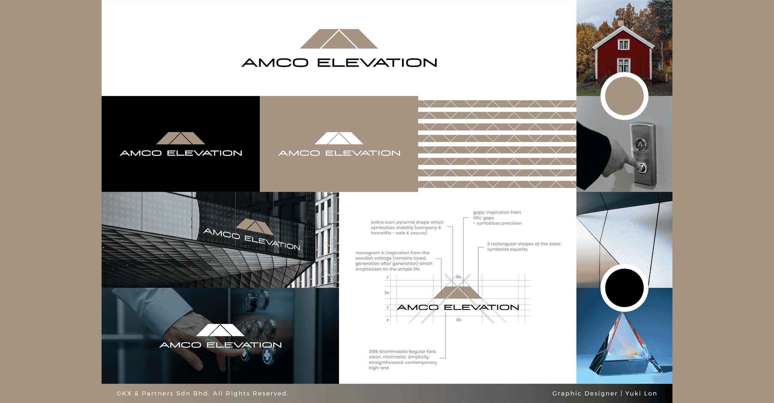
Logo: The logo’s “A” monogram, inspired by a Swedish cottage, symbolizes quality. Gaps represent lift precision, side rectangles signify gender equality, and the pyramid shape conveys stability. The clean, minimalist typeface reflects a high-end approach.
Understanding the Brand
Before designing, we analyzed vertical mobility’s brand, emphasizing reliability, innovation, and accessibility in residential lift solutions. We aimed to create a logo that reflects these values and stands out in the industry.
Key Brand Attributes:
- Reliability: Safe and dependable lift solutions.
- Innovation: Latesttechnology in home lifts.
- Accessibility: Safe and available home mobility solutions.
Vertical Mobility (Home Lifts) Company Logo Design Process
- Research and Inspiration
Our design team researched industry trends, competitor logos, and design elements symbolizing movement and accessibility. We explored colour psychology, shapes, and typography aligned with innovation and reliability.
Research Focus:
- Industry Trends: Current home liftsector design preferences.
- Competitor Analysis: Effective elements in competitor logos.
- Design Elements: Symbols of movement, stability, and accessibility.
- Concept Development
Based on our research, we brainstormed simple yet impactful designs that suggest upward movement and stability, resonating with lift and elevator concepts.
Conceptual Elements:
- Simplicity: Easy recognition.
- Impact: Memorable and distinctive.
- Symbolism: Signifying upward movement and stability.
- Refinement and Feedback
After presenting initial concepts, we refined the chosen design by adding another triangle to the logo based on client feedback.
Feedback Process:
- Initial Presentation: Showing multiple concepts.
- Client Feedback: Gathering insights and preferences.
- Design Adjustments: Refining based on client feedback.
Final Logo Design
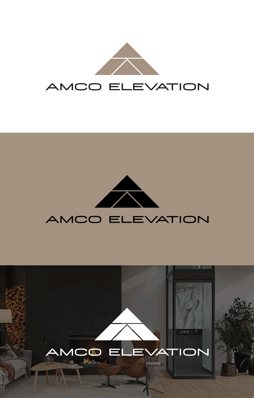
The final logo for Amco Elevation perfectly blends form and function. The icon, an upward arrow integrated with the letter “A,” symbolizes progress and elevation.
Key Features:
- Icon: Upward arrow integrated with “A”.
- Typography: Sleek, modern typeface.
- Colour Palette: Shades of champagne and black for trust and professionalism.
Impact and Results
Since the launch of the new logo, Amco Elevation has received positive customer feedback, boosting brand visibility and recall. The logo effectively communicates the company’s commitment to innovation and customer-centric solutions.
Observed Benefits:
- Enhanced Visibility: Improved recognition in the market.
- Positive Customer Response: Increased engagement from customers.
- Brand Recall: Stronger brand presence and memory.
Brand Collateral Design Development
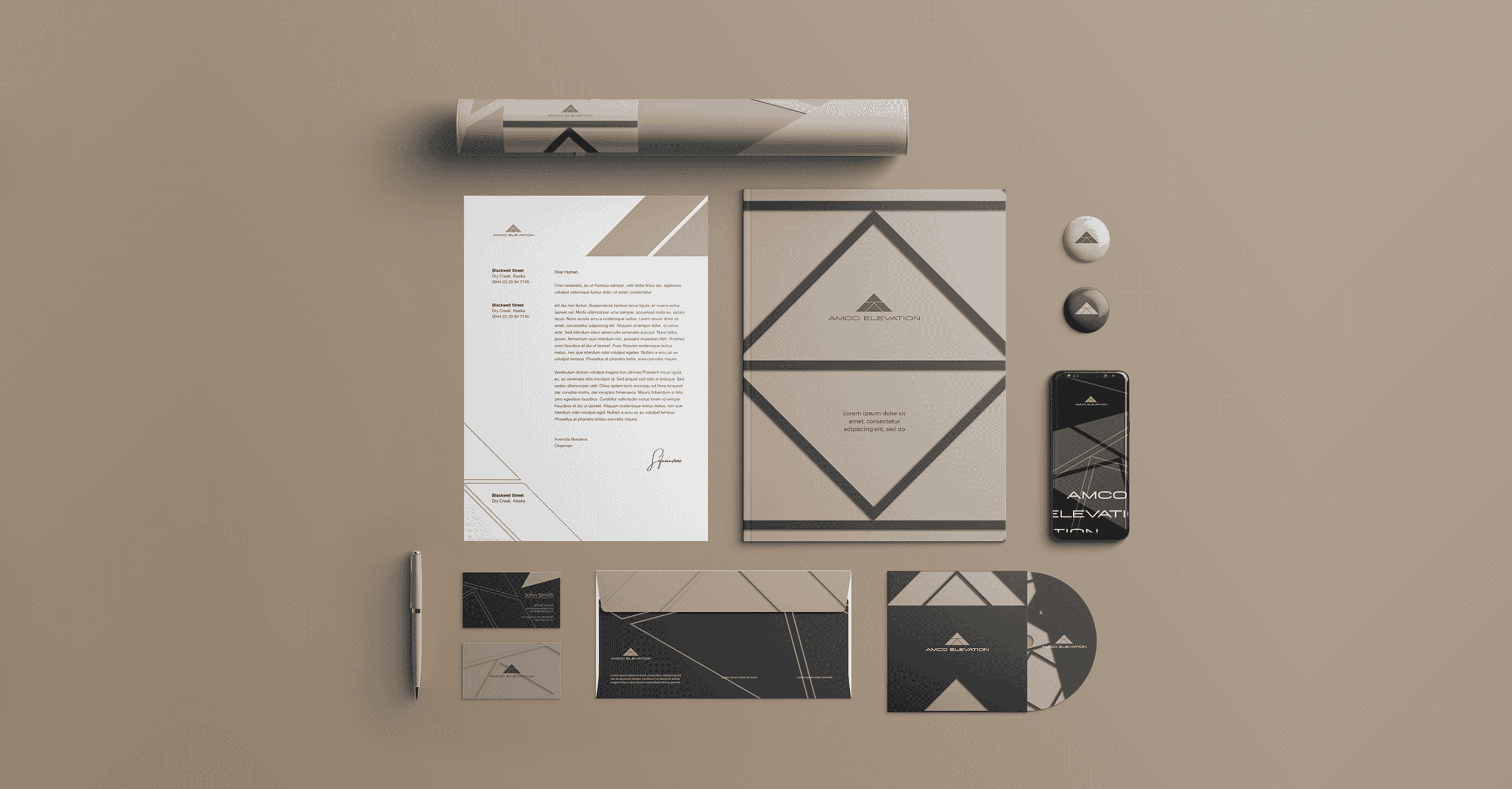
With the new logo finalized, we created cohesive brand collateral, including letterheads and business cards, to ensure consistent, professional communication and reinforce the company’s identity in every interaction.
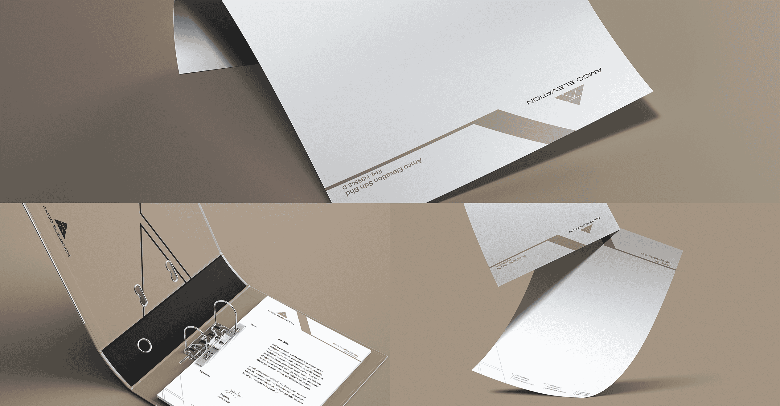
1. Vertical Mobility (Home Lifts) Company Letterhead
A well-designed letterhead reinforces brand identity and professionalism in written communications, integrating the new logo for clarity and readability.
Key Features:
- Logo Placement: Prominently displayed for instant brand recognition.
- Contact Information: Clear presentation of address, phone, email, and website.
- Consistent Design: Utilizing champagne and black hues to maintain brand consistency.
- Typography: Modern fonts enhance readability and complement the logo.
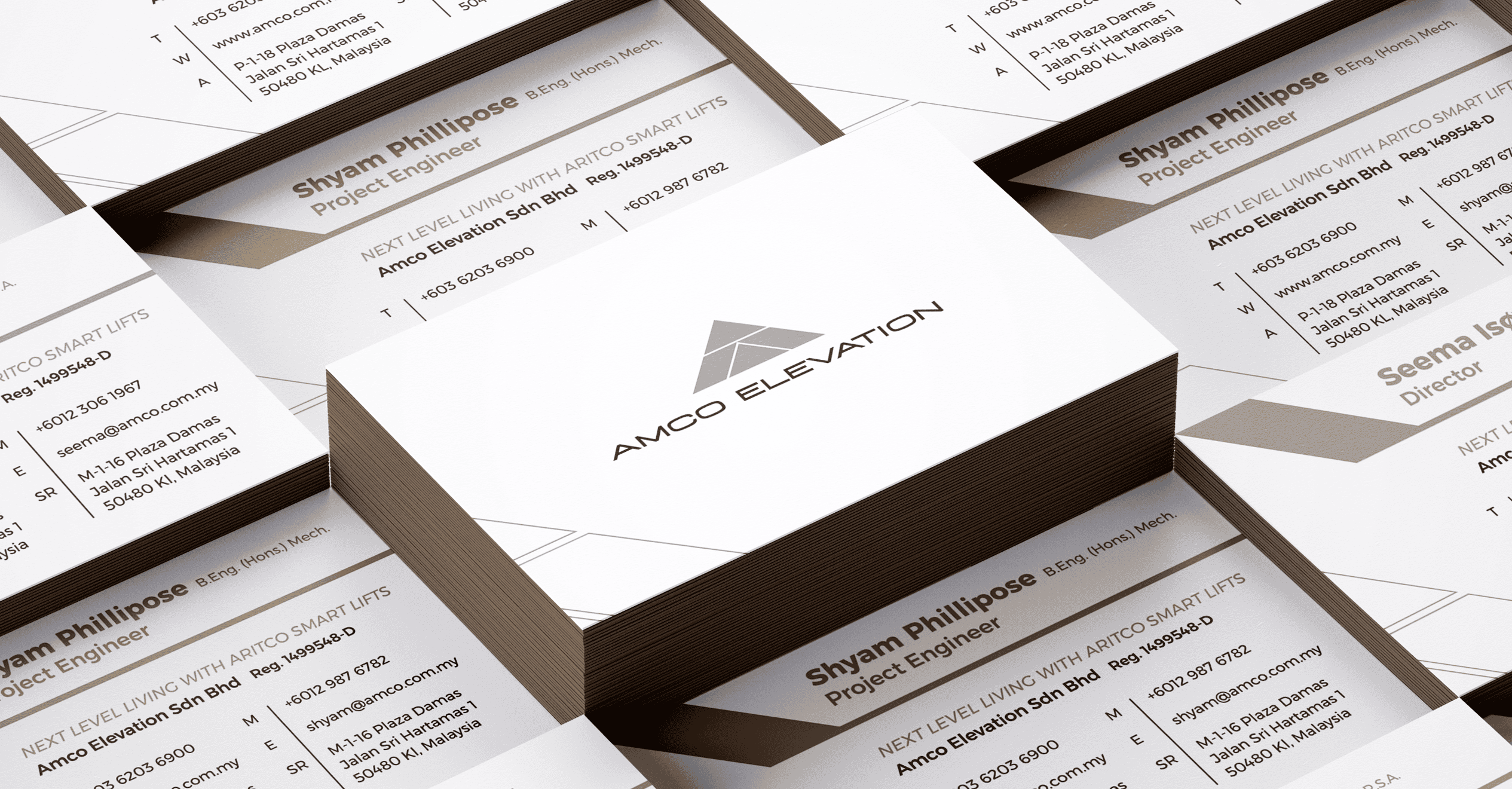
2. Vertical Mobility (Home Lifts) Company Business Card
A business card concisely represents a company’s brand, leaving a lasting impression in networking and client interactions. It combines visual appeal with essential information.
Key Features:
(a) Front Design:
- Logo Display: Ensures immediate brand recognition.
(b) Back Design:
- Name and Designation: Clearly states the employee’s details.
- Contact Details: Includes phone number, email, and physical address.
- Brand Colours: Maintains professionalism with champagne and black hues.
Apparently, from logo design to brand collateral, we have significantly strengthened Amco Elevation’s market presence in vertical mobility (home lifts) industry. This case study shows how strategic design enhances brand identity and fosters customer trust in competitive markets.
Kangxiang, an ISO-9001-certified website design agency that holds a Google Partner certificate. We elevate your brand identity and deliver strategic solutions for competitive markets. Contact us to transform your brand today!



No Comments
Sorry, the comment form is closed at this time.